Manlius Home Featured in the Syracuse Post Standard
House of the Week: Beauty Queen Status
By Marnie Eisenstadt | meisenstadt@syracuse.com on March 08, 2013 at 6:00 AM, updated March 08, 2013 at 12:47 PM
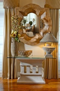
The Hepburn has all the features you’d expect from a home named for a film icon — beautiful finishes, granite countertops and California closets throughout.
But there’s a detail that’s carried throughout the house that might escape a first look: Every corner is rounded. Every angle is smoothed.
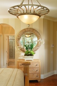
“It’s comforting,” said builder Dave Zellar, running his hand over one of the rounded corners. The entries to most rooms are arches instead of square angles.
The house had local beauty queen status: it was featured in the Parade of Homes in 2010. It’s tucked in the Manlius hills in what’s technically a condominium development called Villas at Mallards Landing. That status means the taxes are 40 percent lower than what they would normally be on the property.
There’s a homeowner association fee of $190 per month. That takes care of snow plowing, lawn mowing and landscaping.
The three-bedroom, two-and –a-half-bath home was built for the specific lot. There’s a morning room off the kitchen that looks out over the hills and fills up with sun. It was designed with that effect in mind, Zellar said. And when there’s no sun, the walls make up for it. The wallpaper in the morning room is bursting with pink, yellow and red blooms. The house was decorated by Marcia Philipp.
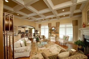
The ceilings are 11-feet high with crown molding throughout the downstairs. The great room has coffered ceilings, so you get the grand impression without losing that comforting feel. The dining room has a tray ceiling.
The home’s arches extend to the hearth and built-ins in the great room. They all have rounded edges.
And the arched feel continues into the master bath, where the soaking tub with air jets sits in a windowed-nook under a comforting arch. There are stacked pieces of stone around the tub and on the shower wall. Zellar said people questioned whether it would be hard to clean during the tours of the home when it first went on the market.
“Look at it. It still looks perfect,” he said.
One of the home’s most unique details is the upstairs loft area at the top of the stairs. The wallpaper has trees on it and the branches have been painted up onto the ceiling. The window treatment is held up by twigs instead of a curtain rod.
The floors in the loft and throughout the home are oak. Zellar promises they’ll be creakless forever. Even the home’s furnace and ductwork is done so it doesn’t make any of the rattle you might find in another house with forced air heat. The home’s appliances and insulation make for a utility bill that average $220 a month.
The details:
Address: 147 Gadwall Lane, Manlius Price: $549,000 Taxes: $12,955 Size: 3,200 square feet Monthly Mortgage: with the standard 20 percent down, the payments would be $2,131.97 a month based on 20 percent down with a rate of 4.125 percent based on the recent national Freddie Mac average. With 24 percent down, the loan moves out of the “jumbo loan” category. Then, the payments would be $1,901.73 with a rate of 3.625 percent. Built: 2010 School District: Fayetteville-Manlius
Great room: The front entry opens into the great room with 11-foot coffered ceilings. The room has built-ins and a gas fireplace, all with rounded edges that match the homes many arches.
Dining room: The dining room has a tray ceiling, fabric chandeliers and faux painting on the walls.
Kitchen: There are painted wood cabinets that close automatically. There are sunflower granite countertops and a matching backsplash. There are built-ins for knick-knacks at the end of the kitchen island. The stainless appliances are Kitchen Aid and include a double, convection and warming ovens. There’s also a built-in wine rack and bookshelves for cook books. The kitchen opens to a morning room/breakfast nook that’s full of windows and light. There’s a door onto covered veranda made from Stampcrete.
Powder room: The powder room is off the mud entry and is sizable for a half-bath.
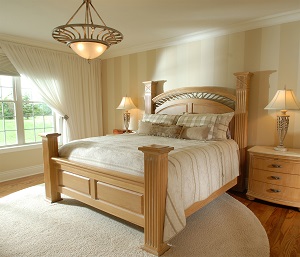
Downstairs back hall: There’s a California closet for storing gear, shoes and anything else that needs to be hidden. There’s also a laundry room and office with built-in desk off the back hallway. Master bedroom: The best feature of this room is that it opens to the same veranda as the morning room. There is striped wallpaper and large his and hers California closets. Master bath: features a Jacuzzi tub in a quiet windowed nook. There are stacked stones both there and in the shower. There are double sinks and granite countertops.
Upstairs: The loft area has tree wallpaper and faux painting that extends the branches to the ceiling. There’s a window treatment that uses twigs instead of traditional curtain rods, completing the nature theme of the area. There’s another full bath with a single sink and tub-shower combination.
Second bedroom: The second bedroom is painted red and is wired to also be used as a media room. It is a sizeable closet.
Third bedroom: The third bedroom is larger and has a nook that’s the perfect spot for a desk. It has the same sized closed as the second bedroom. The window treatment in that room uses belts instead of curtain ties.
Contact Marnie Eisenstadt at 315-470-2246 or meisenstadt@syracuse.com. To nominate a house of the week, send an email to meisenstadt@syracuse.com.


